Aubun Filter Company
Brand Identity | Infographic Design | Client Management
Aubun Filter Sense was looking to breath a new life into their brand identity. As an industrial particulate measurement company, they ensure workplaces have safe ventilation & are conscious of their environmental impact. After meeting with the board, we identified two directions to pursue.
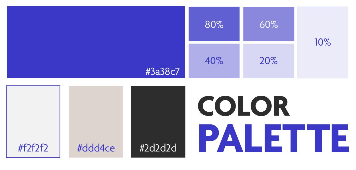


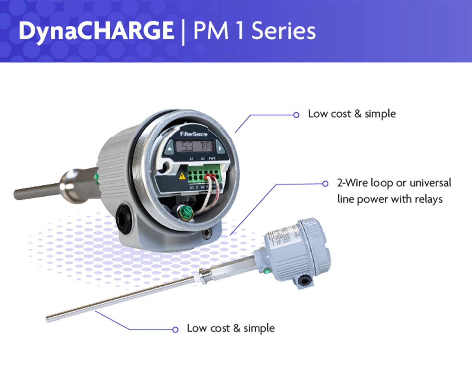
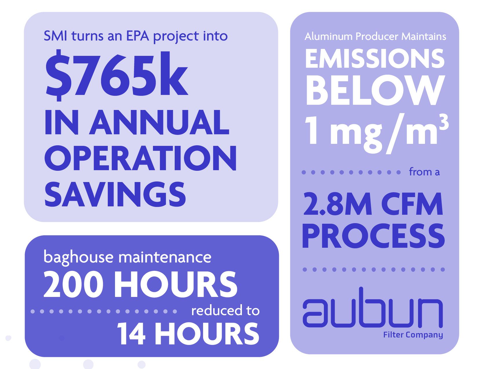
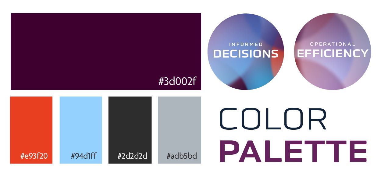
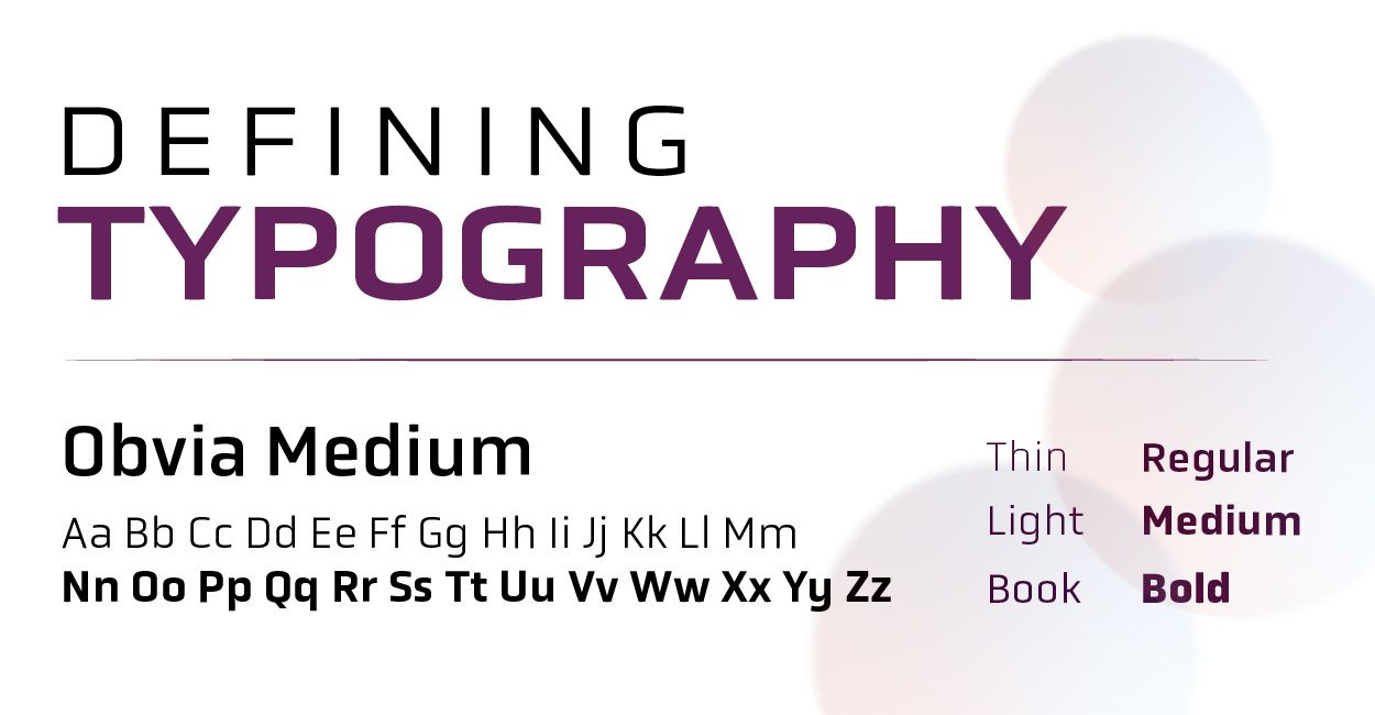
Concept one emphasizes data driven solutions, establishing Aubun as an expert with an innovative mindset. Bold colors paired with a clean sans serif make technical solutions approachable and engaging. A halftone circle icon is used to represent air particles. Product sketches and color opacities are shown to highlight the company's transparency in their practices. which allows them to build trust with their clients.


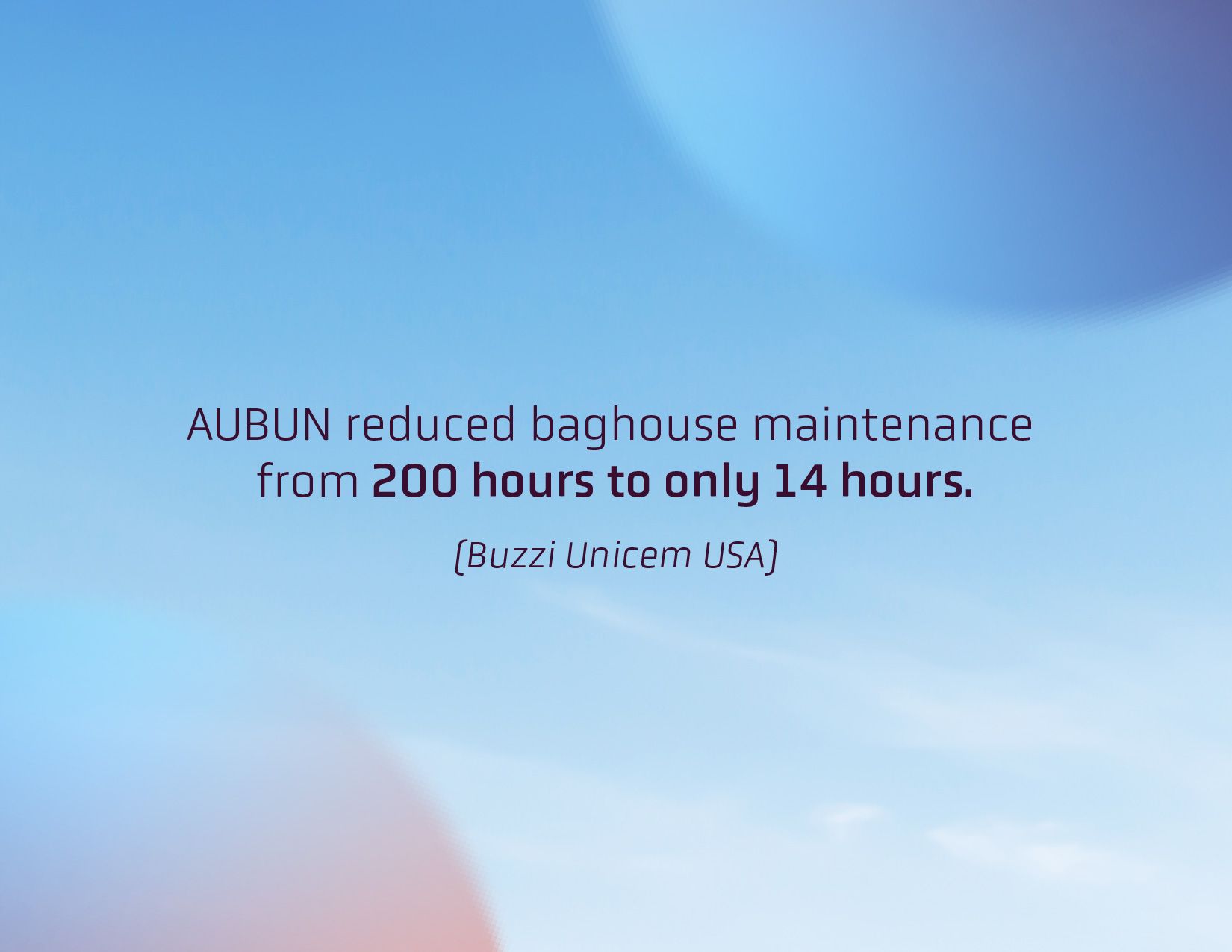
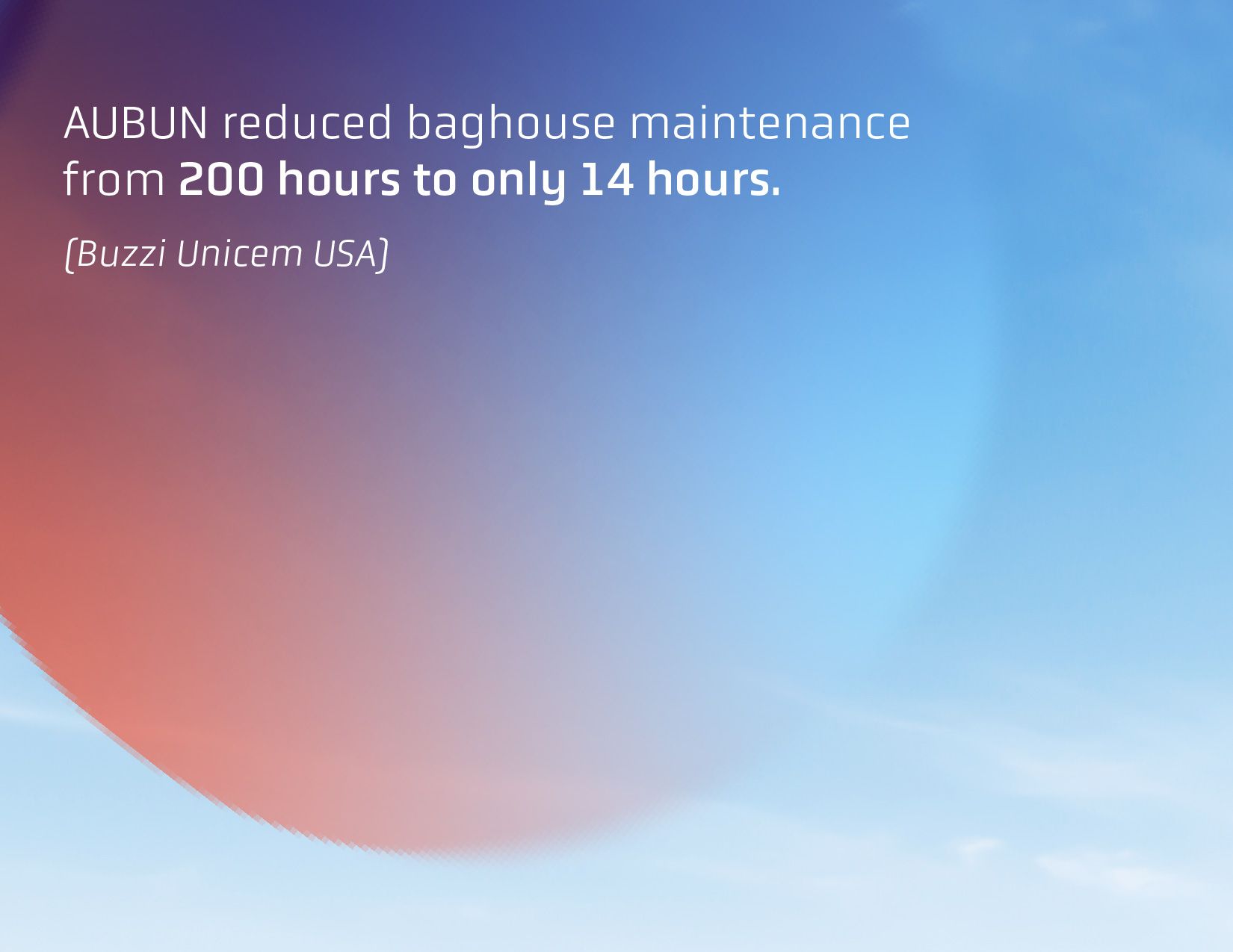
Direction two focuses on the concept of breathing fresh air. Generous negative space is used in compositions and clear sky imagery is invoked to channel the feeling of fresh air. Flexible gradients are used to capture the idea of air & environmental impact. In contrast, the typography is geometric and structured to establish Aubun as an industry technical expert.


Once Aubur chooses a brand direction, brand guidelines will be produced and client facing materials will begin to be updated accordingly. Internal assets will be developed as well.
Want To See More?